
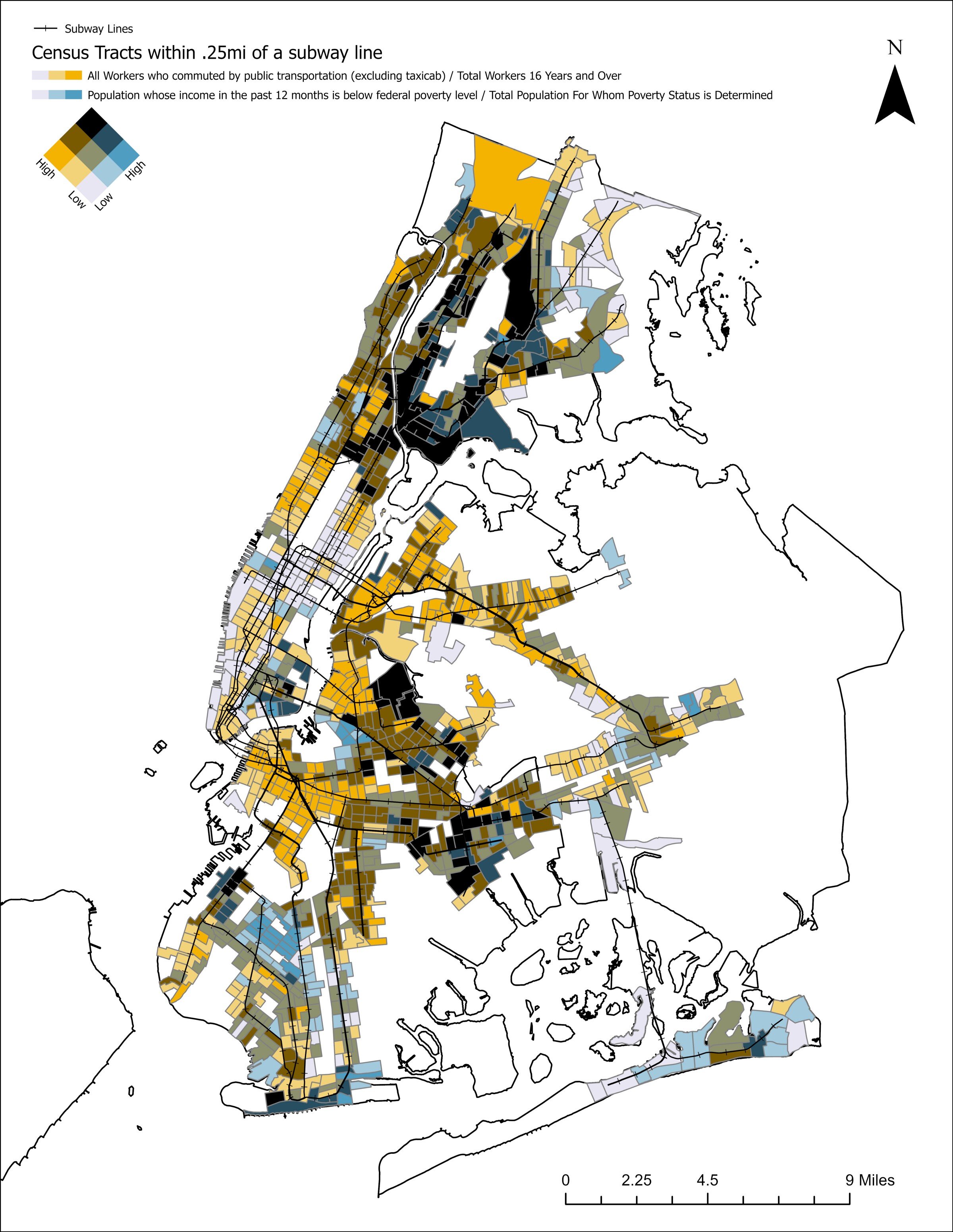
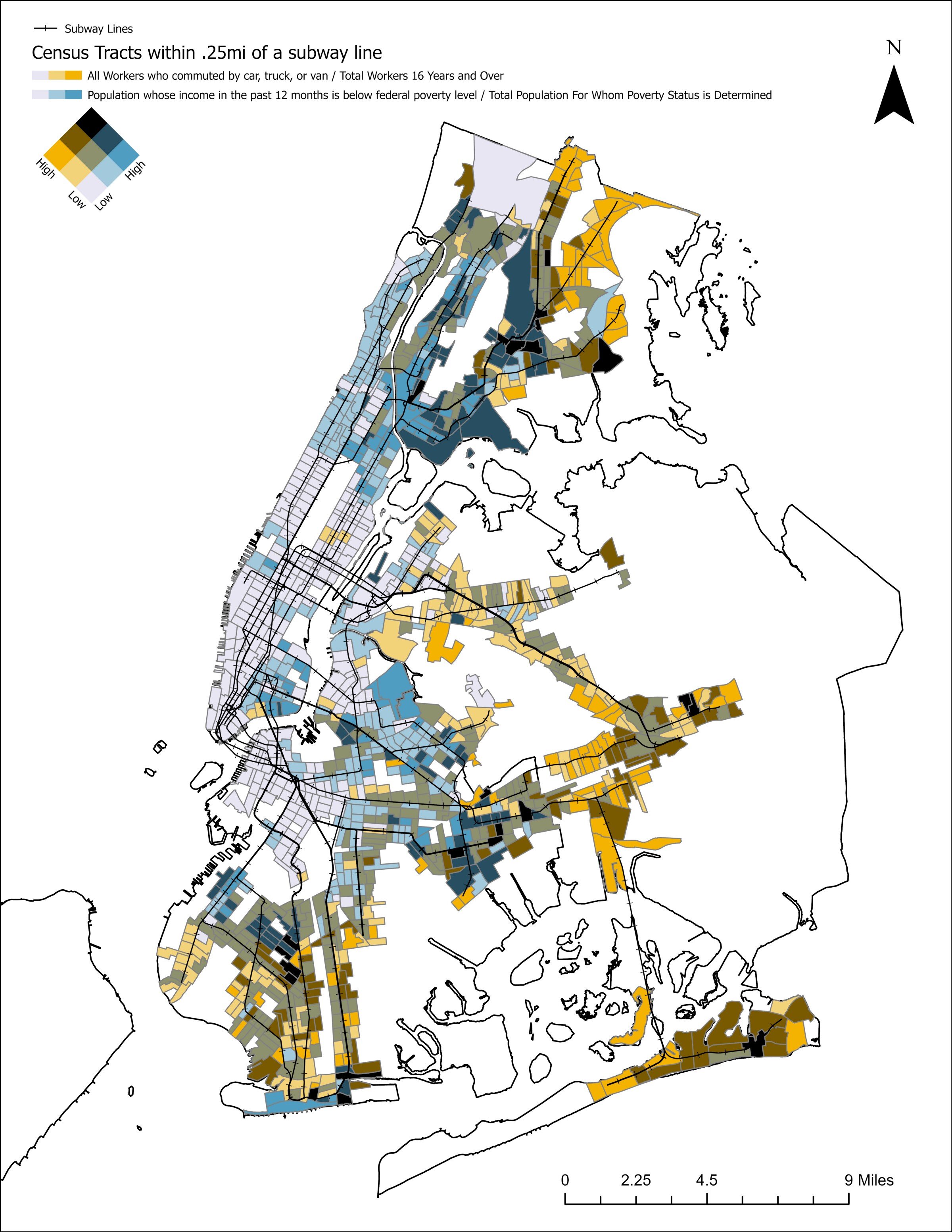
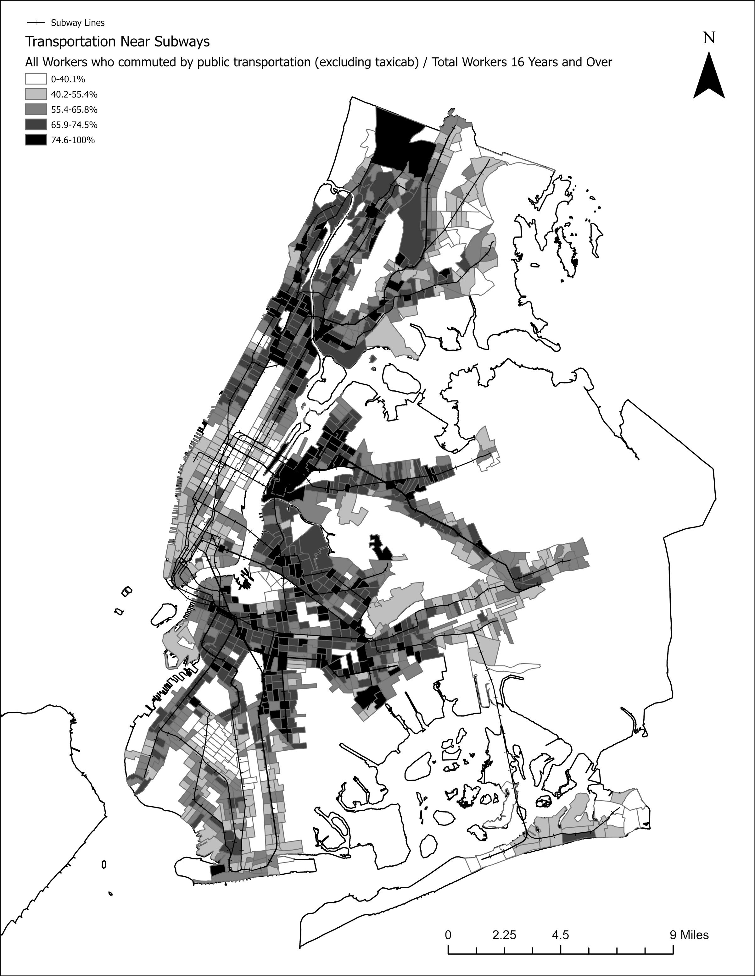
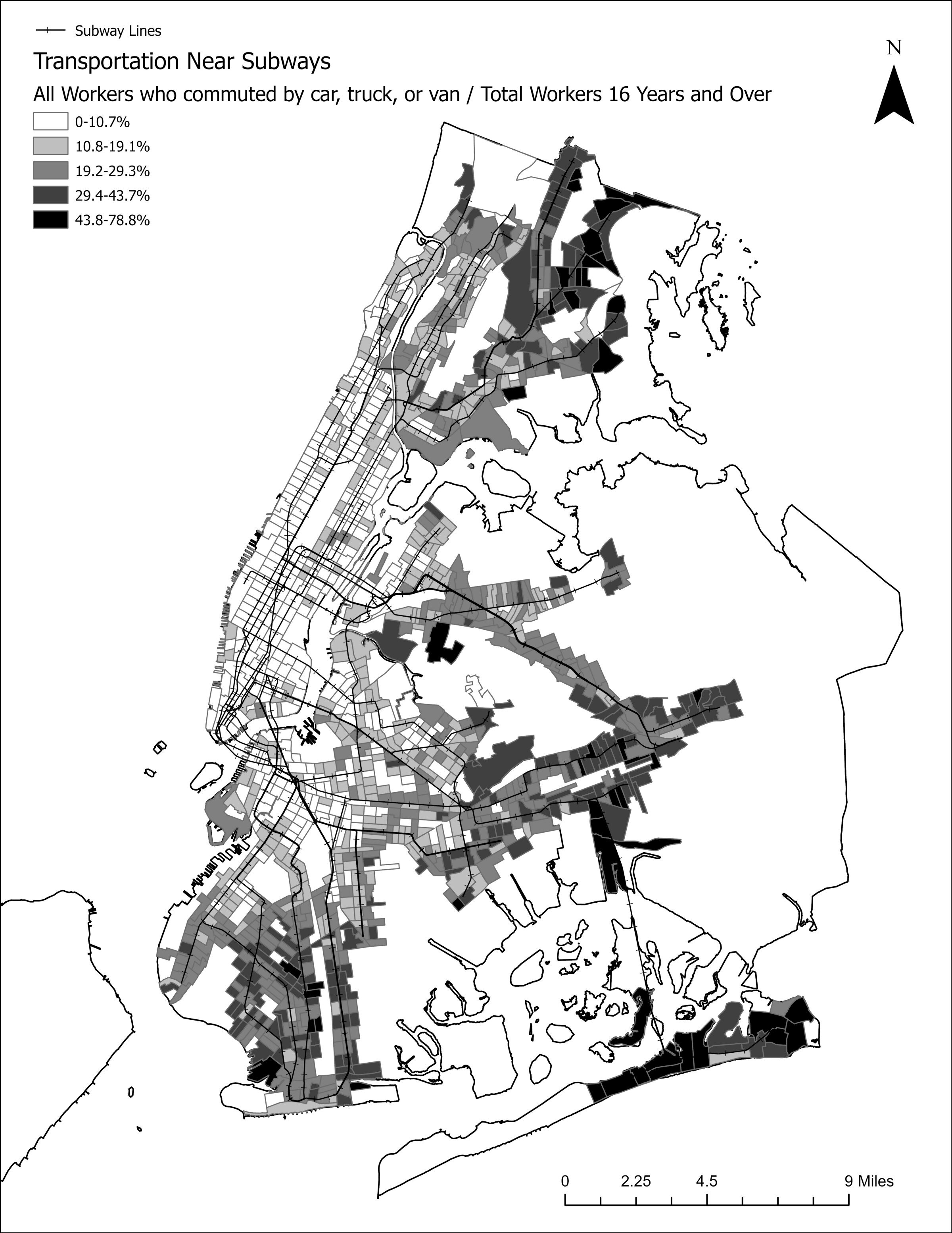

Visualizing the American Nightmare
It doesn’t take a lot of effort to see the nightmare of living in the United States. From the lack of basic infrastructure, including running water, to the (as of this writing) 247,834 deaths resulting from COVID-19 it’s sitting in plain sight. The nightmare is uneven in who is affected by it, making it easier to overlook, dismiss, and turn into a political talking point rather than address with concrete actions. Recently, Zbigniew Grabowski of the Urban Systems Lab at the New School for Social Research created a simple visualization of rent-burdened households in the United States. The map presents a stark image of American life in which the majority of the country, in terms of both land area and population, have more than 50% of people spending more than 25% of their income on rent.
Happy #GISDay2020! Thanks to all the mapmakers, modelers, and critical #geographers working for #climate #justice and #equity. Map of rent burden in the U.S. by @zjgrabowski https://t.co/DvJF1N6xyR pic.twitter.com/PVbsb54qHv
— Urban Systems Lab (@USL_NYC) November 18, 2020
I couldn’t help but wonder what other basic facts of the American Nightmare look like mapped? What follows are a series of simple visualizations of data from the American Community Survey along with some brief thoughts on the matter. This isn’t meant to be rigorous academic analysis, but rather an articulation of what I see when I see “America”.

There are 3,141 counties in the United States. Of these, nearly 7.5% have more than 25% of their population living below the federal poverty line ($21,720 for a three-person household.) These counties are concentrated in the US South (specifically the Black Belt and central Appalachia), the South Texas borderlands, and the same reservations experiencing plumbing poverty in the desert Southwest. Pockets appear elsewhere, but it’s not necessarily surprising that those experiencing the highest levels of poverty in the country are the people who have been targeted by US government policies focused on their extermination, removal, and subjugation. You could say it’s because it costs less to live in these areas, but they are also rent burdened.

Over 44% of US counties have between 22.8 and 79.6% of households without internet access. This is, in the best instance, about 1 and 5 people. Again, the Black Belt, Appalachia, reservations, and borderlands are among the highest areas and its completely unsurprising that there is such a strong correlation with poverty levels. But, given the widespread shift to internet usage for remote working and learning since March it becomes clear why at least some people simply cannot deal with lockdowns. I’m not referring to the people not represented by this map, who use the internet to spread easily debunked claims and to dismiss the trauma experienced as part of partisan politics, but rather those for whom it was never an option. According to the CDC, Mississippi and Louisiana have the highest death rates in the South and are well represented on this map. To what extent were those deaths the result of a lack of an alternative? People forced to continue working through a deadly pandemic, probably without adequate access to healthcare or insurance…


Taking Down Racist Monuments. All of them.
Like most multi-generational, white Floridians, my family tree is deeply entwined with Florida’s racist history. A Columbia County slave schedule dated October 12th, 1850 lists my 3rd great-grandfather, Durham Hancock, as having enslaved three people: a 22-year-old woman, a two-year-old boy, and a four-month-old girl. On the other side of that same branch, my 3rd great-grandfather Elisha Howard was a corporal in Georgia’s 52nd regiment during the Civil War.
Elisha lived near the small town of Sanderson, Florida. Sanderson was named for John Pease Sanderson, a member of Congress of the Confederate States of America. Sanderson was, at the time, part of Bradford County — named for Captain Richard Bradford, a Confederate officer. It is now in Baker County, named for James McNair Baker, another Confederate senator. In all, Florida has 7 counties named in commemoration of the Civil War and the Confederacy: Baker; Bradford; Brevard, named after Theodorus Brevard, Confederate comptroller and father of Brigadier General Theodore Brevard; Hendry, after Confederate officer Francis A. Hendry; Lee, after Robert E. Lee; Pasco, after Confederate veteran Samuel Pasco; and Dixie, named in 1921, well after “They Drove Old Dixie Down” but shortly after the peak of racist Confederate monument building.
The twigs and branches stemming from these two men form a lattice that includes confederate soldiers and veterans of the Seminole Wars (there are 6 counties memorializing people associated with that, including Miami-Dade.) There are another 15 counties named for slave holders like my 3rd great-grandfather Elisha. At final count, Florida has 28 counties that in some way memorialize people or events related to the racist and genocidal history of the state and country. Some of them are common: the founding fathers (Washington, Jefferson, Madison, Monroe, Franklin, Hamilton) are all well represented. Others are less common, like Francis “The Swamp Fox” Marion, who not-so-famously raped the women he enslaved and hunted indigenous people for fun. John C. Calhoun, who called slavery a “positive good” gets a county, too.

Debates rage about the legacy of racist monuments. Monument Avenue in Richmond, Virginia has become a hotbed of activity during the Black Lives Matter protests following the killing of George Floyd by a Minneapolis police officer. Statues of Jefferson Davis, Christopher Columbus, and Williams Carter Wickham were all pulled down by protesters. A statue of Black tennis legend Arthur Ashe was vandalized with the text “WLM,” a play on the popular shortening of Black Lives Matter that’s used by white supremacists. On the nearby campus of Virginia Commonwealth University, protesters pulled down the Confederate Howitzer statue. Meanwhile, in the United Kingdom, protesters removed a statue of slave trader Edward Colston, dumping it into the nearby river.
But this isn’t actually anything new, even in Florida. I remember the feeling of celebration when “Old Joe” was removed from his station in Gainesville, Florida early in the morning to avoid confrontations between protesters and neo-confederates. Hollywood, Florida renamed Lee, Forrest, and Hood Streets two years ago after sustained pressure by local groups. Duval County (named for William Pope Duval, who sought to remove native groups and attract plantations using enslaved labor to the state) just unanimously passed a resolution to begin renaming schools named after confederate officers. There are countless other examples from all over the world of these kinds of changes being made.
But what, if anything, should we do about these other monuments in Florida? Could there be a push to rename cities, towns, and counties and if so, what would it look like to do that in a just manner? The scale is certainly different and the level of pressure to affect change would need to be much higher, but Florida was not terra nullius prior to colonization. In fact, counties were created and renamed seemingly on a whim or over petty squabbles between landowners. Could residents work with our various indigenous groups to restore their place names? Micanopy, a small town outside of Gainesville in Alachua County is named for the Seminole leader who defeated Miami-Dade namesake Francis Dade. What would Florida’s landscape look like if other parts of the state were similarly named? I don’t have an answer, but now is the time to start posing the question.